Category Archives: Book design

…and that has made all the difference.

SBCovFn3

Early on in Sandra Boston’s life she decided to head down a road less travelled by. That road has taken her around the world and into the hearts of those she encountered. In this memoir, Sandra details her journey and what it has meant to her along the way. She asked if I would help her with her cover design for Out of Bounds: Adventures in Transformation.

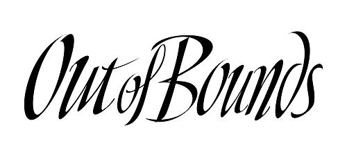
I agreed, and working with photos taken along her journey I developed a design concept for the front and back covers. At first, I used a font for the book title, and though it looked fine, it somehow didn’t quite reflect the sprit of Sandra’s life. So I custom designed an original hand lettered title – what I refer to as interpretive lettering. Sandra was on board as soon as she saw it and the book was soon thereafter published.

Above is the finished book cover and below is the artwork I developed using Adobe Illustrator and incorporated into the cover. 

SBHEAD

Share on FacebookTweet about this on TwitterPin on PinterestShare on LinkedInEmail this to someoneShare on Google+

A whole lodda Remodelin’ goin’ on…

For the past five years I’ve spent nearly all of my full weekends remodeling our home. It was a lodda work, but well worth the effort.

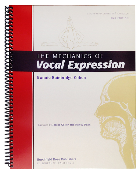
During that same time period and beginning even farther back, I’ve been remodeling a client’s self-published book. I completed it early last summer and it finally went to press in June 2015.  Also, a lodda work, but we’re all happy we made the effort and that it is now out in the world. Here’s the cover…

MVEBkCovFrFnSm

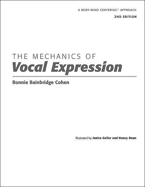
The book is called the Mechanics of Vocal Expression written by Bonnie Bainbridge Cohen, author, teacher and founder of the School for Body-Mind Centering®. The first edition, published in 1985, was typewritten and photocopied with pasted in illustrations. This was pretty limiting in terms of design options, but the book was well received and treasured for its content..

Fast forward a little more than twenty years when Bonnie first approached me about the redesign. By then the technology was actually making it possible to design books using a personal computer with all the design tools a designer could dream of. And so the process began with Bonnie revising and updating her original text and me working out how to organize the material so that it was visually user friendly as a work book.

Bonnie makes extended visits to locations around the globe to take people through her extensive course and training programs. The book had to be worked in around this intense schedule which was the main reason the project took so long to complete.

i first met Bonnie and her husband Len back in the 1970’s when they first arrived in the Amherst area. I have worked with them on several projects over the years and now with their kids who are handling various aspects of the operation. Together, they’ve touched a lot of lives in really positive ways centered around Bonnie’s work. To learn more about Bonnie’s work visit the Body-Mind Centering website and/or Facebook page.

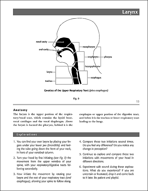
Here are some pages from the interior of the book. There are several sections to this workbook with chapters containing instruction with illustrations as well as exercises for the reader to practice.

MVEBkFnii2sm

The title page above, sets the tone of the overall layout.


MVEBkFnii

Here is the title page spread as would be seen when the book was open.


MVEBKFnxii

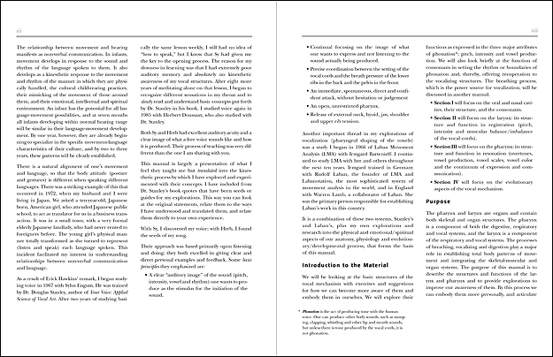
The above layout is a spread from the book’s introduction.


MVEBkFnxvi

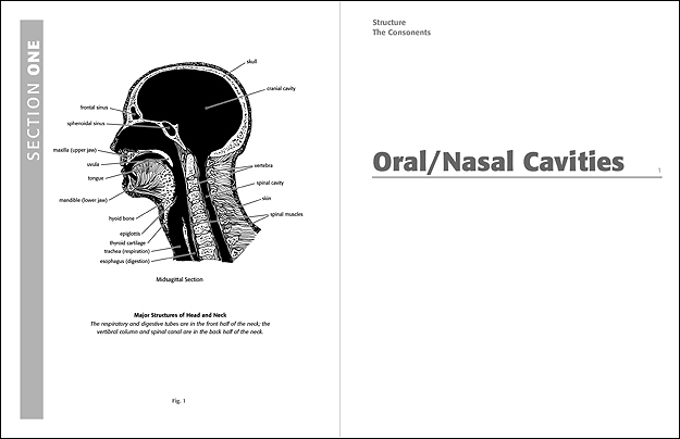
Here is a spread showing a section opening.


MVEBkFn142sm

Above is a typical chapter page containing instruction, illustration and exercises.


MVEBkCovBkFnSm

This is the back cover and below is a cover shot showing the spiral binding, The spiral binding makes it possible to perform the exercises, some using the whole body, without losing one’s place. The book lays flat on the floor or table when opened without springing closed.

FrCover

Share on FacebookTweet about this on TwitterPin on PinterestShare on LinkedInEmail this to someoneShare on Google+

A new home for a rare book

OLYMPUS DIGITAL CAMERA

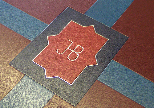
This is a closeup of the back of one of the two boxes Peter created from boards and leather

What I love most about my business is working with clients on projects i would have never conceived of.

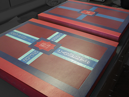
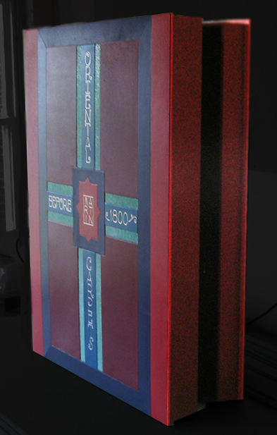
Peter Geraty of Praxis Bindery in Easthampton, Mass. contacted me last January about a project he was working on building a leather bound box, two actually, that would house the plates and text from a rare photographic volume on oriental carpets crafted before 1800. One box would house the large photographic plates and the other the text. Both boxes would need to be roughly 20″ x 30″. The design concept of the two boxes was mostly that of Peter’s client, which Peter then would realize in boards, papers, leathers and hot stamping.

This required a lot of back and forth, fine tuning the design application. In order to facilitate that process, Peter asked If, given precise measurements, I could create a full size version of the design on the computer. Since Peter’s client lived out of state, this digital version of the design would allow both to better communicate and make adjustments to the design elements. I assured him that this was possible, so I left that meeting carrying a full size, hand executed, line drawing of the box exteriors marked with exact measurements in millimeters.

Using Adobe Illustrator, I was able to build a full size accurate version of the boxes showing all the design elements. Once he approved this line rendering, I was able to begin the work of making a full color simulation of how the boxes would appear when completed.
Leathers

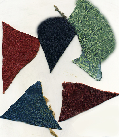
Toward that end Peter gave me swatches of the dyed leathers he had chosen for the project along with hand lettered headlines that were to appear on the cover and spine. The latter was commissioned by the client from lettering artist Stephen Rapp referencing lettering from the time period in which the book had been published.

Lett

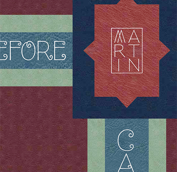
From the swatches I was able to build large samples showing both the texture and color of the particular leathers that I could apply to the elements in the design. I was also able to isolate the individual letters in a word and fill those with a simulation of the palladium leaf that would be hot stamped into the leathers.

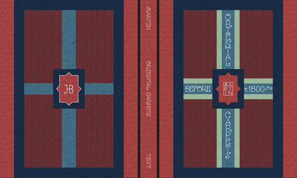
I applied  the color textures to the full size layout and then was able to position the palladium letters onto the leathers in such a way that I could easily adjust them as the design evolved. Because I was working at full size, Peter would also be able to take precise measurements regarding the positioning of the stamp dies.
TxtBkPrf

Above is the final file I created, front, back and spine of one of the two boxes. Below is a closeup showing the simulated texture
TxtFr

Once completed and approved, Peter was able to email his client an accurate file showing how the design would be realized. After some back and forth and a few small revisions, full size prints were made so that the client could get a sense of scale and Peter could have an accurate reference tool as he began hand building the boxes.

One bonus aspect of this undertaking was that I was able to provide the die maker for the hot stamping with accurate files for the dies. Typically, when I do this kind of accurate simulation, the files can be used for actual production. In this instance, the production was all done by hand and with such expertise that I was awestruck by the finished product.

OLYMPUS DIGITAL CAMERA

OLYMPUS DIGITAL CAMERA

Above is the finished cover of one box and below that the front cover of one box and the back cover of the other are seen
OLYMPUS DIGITAL CAMERA


This photo shows the finished box within which the plates or text of the rare volume would be housed.


Share on FacebookTweet about this on TwitterPin on PinterestShare on LinkedInEmail this to someoneShare on Google+

Book by its cover…

Cover19Prnt

A few years ago a client approached me about designing a cover for her self-published book which is now available as an ebook. The finished design was constructed with a variety of publishing options in mind and last year was adapted for ebook publication. Should the author choose to do a print version the design can easily be adjusted for that purpose.

In our initial meeting the author showed me some images she found on the internet that she thought might be appropriate to purchase for the cover, but I insisted on seeing the manuscript so I could get a real sense of what the book was about.

For a while we toyed around with a number of photographic images available online, but as is often the case, though there were millions of images to choose from, none was quite right on the mark. We discussed illustration, but that idea was nixed due to restrictions in the budget.

In our conversations I discovered that she had a good camera and that photography was an important part of her life, so I suggested that she try to set up her own photo shoot using props that were suggestive of the content of her book. I knew that if the resolution was high enough I might be able to work with the images to come up with something.

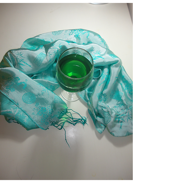
To her credit, she jumped at the idea and gave me a disk containing lots of high resolution images. From that I selected a few to work with and after some back and forth we settled on the following image.

JuliePhot

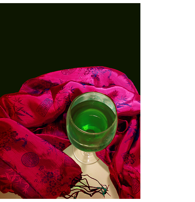
I then set to work to adapt that image to fit the atmosphere of her story and writing and what emerged was the image below. It is a good example of the kinds of thing that can happen working with Photoshop.

redShroud2bblg

We then spent a while exploring typographic options and in the end arrived at the cover pictured at the beginning of this post. We were both quite happy about the outcome and I was particularly pleased that we were able to incorporate one of her own photographs.

Share on FacebookTweet about this on TwitterPin on PinterestShare on LinkedInEmail this to someoneShare on Google+