Category Archives: Signage

A signage facelift at P&Es

PnEBK Wind

Paul and Elizabeth’s natural foods restaurant is a landmark in Northampton. The owners – you guessed it – Paul and Elizabeth, arrived in Northampton from Boston in probably the mid 1970s. Both were learning the natural foods restaurant business at the Seventh Inn restaurant and school from master chef Hiroshi Hayashi. Paul and Elizabeth wanted to carry forward what they were learning by establishing a restaurant in Northampton similar in concept to the Seventh Inn. My wife and I provided them with a place to stay on occasion while they were in the process of moving and setting up the restaurant.

They arrived with the logo image of the smooching cooks for the restaurant made by another designer, but from the beginning I worked with them on various aspects of the restaurant’s visual identity. I went off to teach for several years in the late 1980s and when I returned in the early 1990s, I helped them update their identity. In 2004, after designing full time for a sign materials manufacturer, I went solo again and so on occasion I still do some work for them.

PnELettBlg

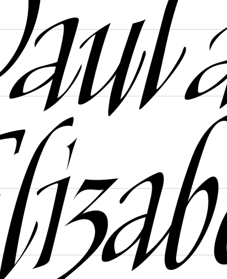
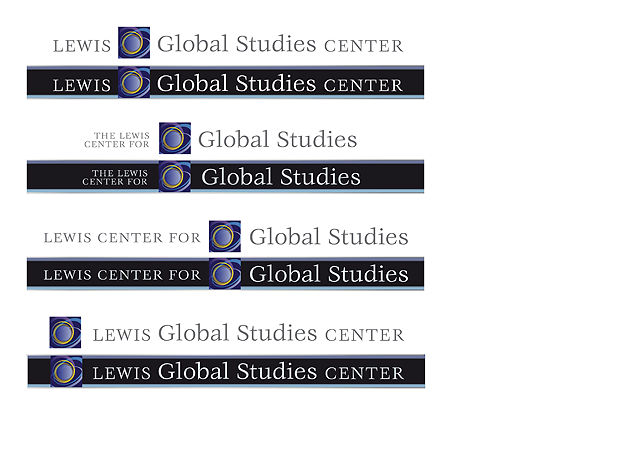
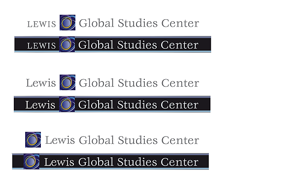
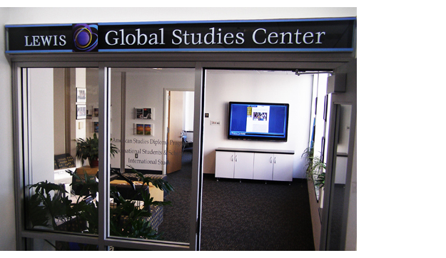
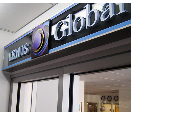
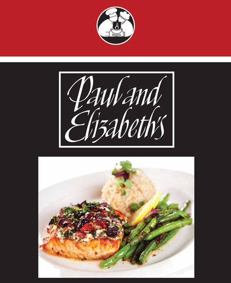
The P and E’s logotype shown in the example at the top of the post is a current application of interpretive lettering I did for them in the early ’90s (above). Interpretive lettering is hand drawn lettering that combines the freedom and energy of calligraphy with the precision and finish of a typographic font. I began building these logotypes in the early ’80s using pencil, pen, ink and black and white gouache on paper and in the late 80’s moved to Adobe Illustrator on a computer, of which this is an example. The skill level and the amount of time to develop such a logotype was about the same as hand construction, but the versatility in application was greatly improved as an illustrator file.

In the meantime, our kids have grown up, their kids have grown up and i recently got a call from Nate, their eldest son who is now taking over the restaurant’s major responsibilities. He wanted to update their signage at the front entrance to Thorne’s Marketplace where the restaurant is located, and the menu displays at the front and rear entrances to the restaurant itself.

After taking measurements and photos of the site I provided them with a concept that we decided to go with after a few revisions. Boxes had been previously built and installed at the front outside of Thornes and just outside the dining area. Both boxes had glass doors that opened to a cork display area on which they had previously pinned up menus.

To make things interesting, I  decided that part of the design would be applied to the glass door with the rest against the cork interior. This provided some dimensional interest.  At the back entrance, the sign was to be hung inside facing out to the street. I maintained the design concept, but there was no viable way to do anything dimensional.

The examples below, are what I showed them for design concepts. I firmly believe in showing a sign concept as it would appear on location. Though the photos look like the final sign in place, the images I’m showing are my designs superimposed over a photo of the window and the boxes. In reality, that is pretty much how the actual signs look in place. Above each concept is the before example of each of the signs.

OLYMPUS DIGITAL CAMERA
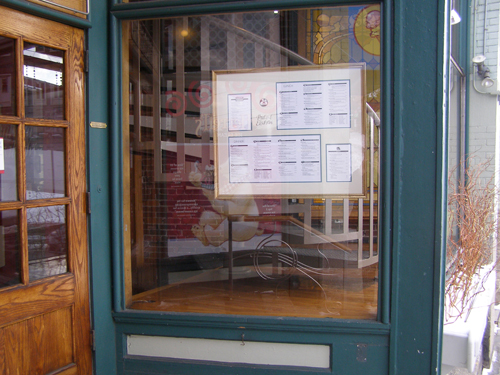
This is what the back entrance sign looked like for several years

OLYMPUS DIGITAL CAMERA
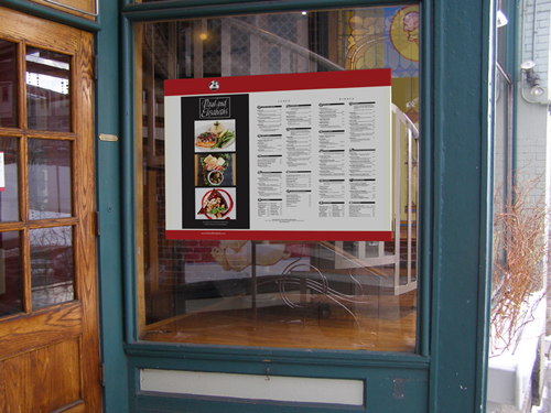
This was the design concept presented for the new sign which is pretty much how the new sign now looks on location.

OLYMPUS DIGITAL CAMERA
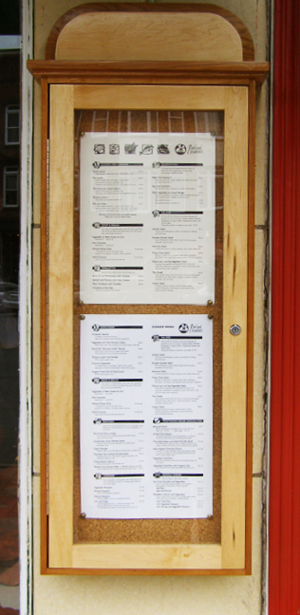
This is how the boxes on Main Street and at the restaurant entrance looked before redesigning.

PEExBxCncpt1prf
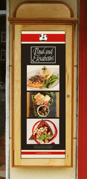
Above (Main Street) and below Restaurant entrance): These were the concepts presented for the new displays and pretty much how they now appear. In both cases the red stripes and logos were applied to the glass and everything else sits on a single panel about 2″ behind the glass.

PEInBxCncpt1prf

Share on FacebookTweet about this on TwitterPin on PinterestShare on LinkedInEmail this to someoneShare on Google+

A World of difference…

GLOBELogoFnBlg

Some might think design was simply a matter of developing a compelling style and applying it to whatever walked in through the door. Consciously or unconsciously, I’m sure there are designers who work in this manner. Designing this way would be quick and easy and execution would follow in a straight line toward the finished product.

I prefer an approach that is collaborative and exploratory in nature. It is rare for me to have a clear preconception of the final product. Presented with a project, I often have strong instincts that inform the discovery process, but of equal importance is client input. Together, we move the project forward toward a final conclusion.

Last year I posted Four Centers and an Auditorium, describing the evolution of a job I did for Smith College. Part of that project was to develop separate identities for most of the centers, under a tight budget and time constraints. The results were fine, but the Global Studies Center identity suffered some from those constraints.

Recently that center received an endowment that allowed it to reconsider that image and  rework the signage. What follows is a brief summary of the evolution of that process.

OLYMPUS DIGITAL CAMERA

Finished sign for Global Studies, Smith College, completed in 2011.

After meeting again with a committee from the center and discussing its mission, I put together some initial ideas.  The second image down in the left column and the top image in the center column were chosen by the committee for further exploration.

Globe ImageBlg


Here are the results of that discovery process.

GLOBE10Blg

GLOBE12


GLOBE9Blg

The image at the top of the right column in the second of the three examples above was chosen for further refinement.

GLOBE12b

It was at this stage that the smaller globe surrounded by the yellowish corona found its way into the design. In the end it was the middle image above that the committee selected as the identity for the center.

At this point, we needed to explore how the typography would work with the image and together how they would be incorporated into the existing signage. Along with the endowment, the name needed to be changed to reference the benefactors. Here are two sets of variations combining image and typography, as a logo and as part of the sign.

GLOBE16BlgEven after it was decided to go with just Lewis Global Studies Center, we needed to explore a few combinations as well.

GLOBE15Blg

Below is what was finally decided.

GLOBE18Blg

Here are some photos of the final sign installed. We were also able to install much needed lighting since the center was situated in an area not well lit. Lawren Rosen, the CEO of ArtFx Signs, came up with a nearly invisible lighting system that illuminates the sign without calling attention to the fixture. ArtFx Signs also fabricated and installed the sign.

In my previous posting, I expressed some disappointment in the interior lighting as pertaining to signage. The lighting of this sign solves that problem, revealing all of its details and subtle coloring – a very satisfying conclusion to this project.

OLYMPUS DIGITAL CAMERA

OLYMPUS DIGITAL CAMERA

It remains somewhat of a mystery as to where this identity came from. It’s certainly nothing I could have imagined ahead of time and that’s exactly why I keep designing.

Share on FacebookTweet about this on TwitterPin on PinterestShare on LinkedInEmail this to someoneShare on Google+

Signage for Four Centers and an Auditorium

The mandate

To design, fabricate and install wayfaring signs for one of the academic buildings on campus. There are four centers and a lecture hall that need to be identified in a tasteful way as one enters the main lobby of the building.

The above project description was part of the initial request I received from Smith College in early November of 2011 for a projected installation of January 2012. Skipping ahead, the photo (below) was taken of the main signs just prior to installation. What follows is an account of the process from that initial inquiry to completion and installation.

Above: I developed the concept and created the final artwork, collaborating with ArtFX Signs in Bloomfield, CT, a top of the line, award winning, sign manufacturer. What you see was all fabricated from raw materials in their state of the art facility.

Evaluation

After initial meetings with the heads of each of the centers I did a thorough site evaluation taking measurements and photos and making observations and within days of the meetings returned with a proposal based on my impressions.

What stood out the most in my mind was visual distraction – lots of steel and glass, bold floor pattern, brightly colored furniture, white walls, black pillars, low ceilings, dark corridors and a wide assortment of functional and informational furnishings. There was little in the way of natural internal logic to guide a visitor to their destination.

Conclusion

Hmm. Challenging. There had been some talk about each center having its own identity, but the thought of adding even more variety to that space made me nervous. Anything subtle would be quickly overwhelmed. Instead, the words that rushed into my mind were bold, in order to survive, unity rather than more diversity, simplicity rather than complexity, clarity rather than confusion. The photo below is a typical example of what I proposed.

All the lettering would be a metallic finish such as aluminum on a black background. I was considering a variety of possible materials that could add elegance to counter the simplicity of these signs, but I wanted to get everyone on board regarding the concept before going too much farther.

Client Feedback

The concept, along with my concerns went to each of the centers as well as administration for review. The feedback was very positive, but in separate meetings with representatives from each center, I was hearing concerns suggesting the strong need for separate identities along with a more colorful approach.

In particular, one of the centers had invested in an identity that had been applied to a signage concept used in their former location on campus. They would have simply moved their main sign, but it wouldn’t fit the new location. They appreciated my thoughts on simplicity and unity but were reluctant to give up the look that they had achieved and were so loyal to.

These were valid concerns and since none of the other centers had an established identity, I decided to modify my approach, keeping in mind my original concerns, but addressing the individual needs of the various centers at the same time.

Since the one center had a very clear idea of what they were after, I decided to carry elements of their design into the remaining signage throughout the rest of the building. The photo below shows their finished sign above the entrance.

The sign is made of clear thick glass, offset from the wall using simple stainless steel brackets. Their logo is applied to the glass using cut vinyl.

The one common denominator that everyone agreed to was that the main signs would be long and narrow and located in the narrow space above each entry. Foremost in my mind was that the sign backgrounds should be black as they were in my initial proposal and that I wanted to carry forward the idea of using glass as a primary material offset from the background, to echo that used in the Poetry Center sign (above). Beyond those three unifying factors the goal would be to make each sign unique with its own strong identity.

Since the Poetry Center identity and sign concept predated this job and because that center’s entry is located just to the right of the main entrance, with taller ceilings and greater visibility, we all agreed that it would retain it’s original look without a black background. We also agreed that given the particulars of the other entrances that we couldn’t carry through that type of sign to the other centers because that approach would be too subtle. With that settled I moved ahead with the other designs.

I began with meetings with staff from each of the centers, trying to learn as much as possible about each center’s mission. Since there was no real budget for building strong identities for each center, I looked for any imagery the center might have worked with in the past. I then developed a graphic image for each center along with a typographic style and a color scheme that seemed appropriate.

Because of budget constraints we kept the back and forth on the design to a minimum, but just enough, so that in the end each center was pleased with their own identity.

At that point my focus shifted to materials. I had done some work for ArtFX Signs in Bloomfield, CT and was familiar with the quality of their work and extensive facilities and resources. They agreed to take on the job and so I sent my concepts, that had been approved by each of the centers, to Lawrin Rosen, CEO so we could discuss materials and fabrication possibilities.

I then developed a structural concept. In the above rendering, the proportions were purposely distorted to emphasize the construction more than the appearance. The angled section is what viewers would see, namely a thin strip of brushed metal top and bottom followed by a stripe of color along the top and bottom, part of which would appear outside the glass and supporting it and part of it showing from the inside of the glass and supporting the glass from the other side. The majority of the glass would then remain clear even though it is not pictured that way in the diagram. The clear glass would look into an all black interior. Dimensional letters and logos would then be adhered to the front of the glass (not pictured here) in contrasting colors to stand out against the black interior.

The ArtFX staff then worked out a more efficient means of constructing this proposed concept the results of which can be seen in the photo at the beginning of this post. Both the design and construction plans were approved and the signs went into production using half-inch glass and aluminum. The signs were installed in early 2012 in time to meet the deadline.

Below are the major signs installed except for the Poetry Center, already shown above.

This center is on the first floor along with the Poetry Center. The other two centers and the auditorium, below, are located in the basement level.

The assignment also included various directional signs strategically placed throughout the building. The first two photos are different views of the directional sign at the main entrance followed by an example from a different location.

About 9 months after these signs were installed, another center was being opened in a different building on campus and the college contacted me again to design new signage similar to the ones from the other centers. Here are two views of that sign installed.


Share on FacebookTweet about this on TwitterPin on PinterestShare on LinkedInEmail this to someoneShare on Google+