
Well, for me it all started in a meaningful way in 1967 at Mass College of Art in Boston. I had some notion in high school that I wanted to be in advertising (as it was referred to back then) but I had little idea what that meant. However, my first two years in school in Boston had completely rearranged my grey matter and I was headed for a major in painting. Being an artist, however it would ultimately manifest itself, was all that was on my mind. It was a world that was completely new to me and was a perfect fit.
Right around the time I had to choose my major I met Arthur Hoener. He was then head of the Graphic Design program, but was first a sculptor and painter doing really fine work. He studied in the Yale graduate program with Joseph Albers and later at the Black Mountain school with Hans Hoffman.
At top of page: Hoener, flanked by his twin daughters, is receiving his state lottery winnings of $100,000 after having already won a million dollars in an earlier lottery.
How’d he do that?
Above: One of Arthur’s later works exploring his own theory on color
Hoener’s design department was no ‘advertising’ program, rather, it focused on visual problem solving with words and images in an in depth manner. I figured I would learn some practical skills along the way that couldn’t hurt in terms of earning a living, but more importantly, I decided that my visual education would be more rigorous in this design department than in the painting department and that I would be in capable hands. I never did regret my decision. In hindsight it was a fabulous mentorship and education and Hoener was always accessible. Considering that my first year’s tuition at Mass Art was around $200 as I recall, it was quite a value.
Arthur passed in the early 1990s, but I’m still occasionally in touch with his son, Arthur Jr. who teaches in the design department at SUNY, New Paltz, New York.
As for me, I was conflicted after graduating because even though my degree was in graphic design, my heart was focused more on the visual than on the more practical applications of such a degree. I spent one summer after graduating focused on drawing and painting on my own in which I produced work I still look back on with great fondness. I had no interest in or resources for graduate school and so I began to make my way with a variety of odd jobs including teaching at a private school and through various continuing-ed programs.
Eventually, I moved to Northampton, Mass., when it was still pretty much a sleepy college town. It was there that I first started utilizing my design skills in my own business making signs and design for print. An offer to teach calligraphy, a subject we spent a lot of time on in Hoener’s design program, revived my interest in the subject that I reinforced through further study, practice and teaching. Soon it was a main focus in my design business.
At times I would try to incorporate calligraphy into a sign or print design project. My frustration and disappointment with the results led me to a technical approach that would combine the fluidity and rhythm of calligraphy with the precision of typography. This resulted in an interesting body of work that eventually helped me attain teaching positions in graphic design at the University of Connecticut, University of Missouri, Columbia and William Patterson College in New Jersey, even without the advanced degree.

Above: This calligraphic ClayFibre heading was hand drawn, painted and corrected.
When I began teaching in Missouri in 1987, as part of my contract I was given a Mac SE (hot stuff at the time) which I taught myself to use and gradually to appreciate. I began teaching my students how to use it as well which was a challenge (1 Mac SE for 70 students) but in addition to that I discovered Adobe Illustrator and found that I could use that program to build the kinds of calligraphic headlines and logos that I continued to be commissioned to create. The software didn’t make the construction any easier, but set me lightyears ahead in terms of applying these to design for print, signs, etc.
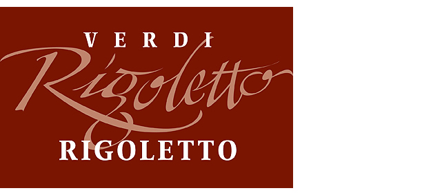
Above: The fancier Rigoletto heading was drawn, filled and corrected using Adobe Illustrator on a computer.
In New Jersey, I was running an entire Mac lab as part of my teaching. This was both good and bad. I was expanding my own horizons in terms of what I was learning about the potential between the computer and design, but the teaching was becoming tedious for me with too much emphasis on the technology. I found I was more interested in doing it than teaching it. So I went off on my own again.
Eventually I took a position with a sign materials manufacturer where my job was to create samples from the sign materials they manufactured to be displayed at trade shows and used as sales samples. Part of the learning curve on the job was to work on PCs in a Windows environment and to become proficient with computer driven routers, engraving machines and lasers. For about five years this was a dream job for me since it was both lucrative and open ended, allowing me to design with few limitations being imposed.
Above: This entire image was drawn, filled and corrected using CorelDraw on a PC. The files were then sent to an engraving machine and a laser to either cut out shapes from various weights and colors of acrylic material or to engrave through the the top layer of laminated acrylic. The pieces were then all assembled and mounted for presentation.
However 2002 proved to be a bad year for manufacturing and this position became a casualty of the economy. After another year and a half with a local sign company, I decided to complete the circle and go back to operating my own business. It’s been eight years since I made that decision and I’ve enjoyed every minute of it.
So, why design? Well, for me design has been a means to earn a modest living, to help others realize their dreams, and to creatively explore visual ideas. The latter is really what sustains me most and reflects back on what I hope are unique solutions that meet and exceed my client’s expectations. My client’s needs provide me with interesting challenges that I try to resolve with fresh and engaging ideas.
The one major difference between being a studio artist and designing for clients is that at the end of the day I have to accommodate the needs of those who hire me. It is not unusual for me to design something that I truly love only to have the client choose another solution that feels better for their purposes. I’ve learned to be neutral when showing my work because even though I make sure the work meets professional standards, the final choices are not always the ones I would have preferred seeing.
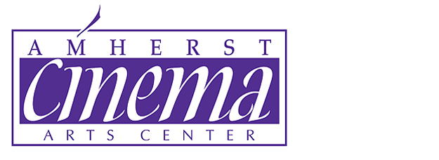
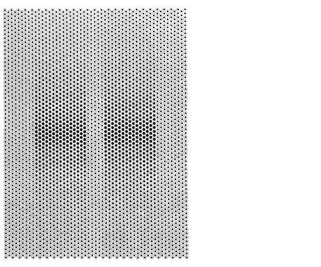
Above: This logo is a favorite of mine that was rejected by a committee favoring something far more generic. I call it a win/win situation. The were happy with their results and I with mine.
It is also not unusual for me, on my own time, to follow through on concepts that were turned down by the client, but which I think are excellent ideas. I can at least show them as part of my portfolio. In the end though, as far as the job is concerned, I put my client’s decisions first and work to make the most of the ideas they choose.
In the end, I design for three reasons – the work itself, the client relationships and as a livelihood. The latter is important, but not my first concern. Helping people communicate with the world around them, is very satisfying and a primary motivation for me. My other primary motivation is the visual work itself, especially when the unexpected occurs as in the case of the Cinema logo above. My best work is never clear from the outset, but rather a result of a design process that leads to discovery.


